Three Films by David Anderson by Anna Gronau (1980)
Originally published in the Funnel Newsletter No. 2, March 1980
Compared with, say, painting, the film image is staggeringly complex. Not only is the movie camera capable of making a good reproduction of a segment of actual vision, it also does this 24 times per second, with optional sound. Faced with this awesome potential, a filmmaker’s first decision is how to harness it. The one property of the medium that helps in these decisions is the rectangular film frame itself which automatically excludes any information beyond its perimeter. And yet it is the decision of the filmmaker as to what will be included. Filmmakers have been forced to discover framing devices which work with the medium based on such wide ranging factors as the content of the image, the sound content, the time period in which the work occurs, an so on. One of the most common solutions to this problem has been the use of narrative which directs the viewer’s attention towards the action of the protagonist through time. Structural filmmakers on the other hand, have limited the photographic content of film and thereby emphasized duration and shape as the framework of their films.
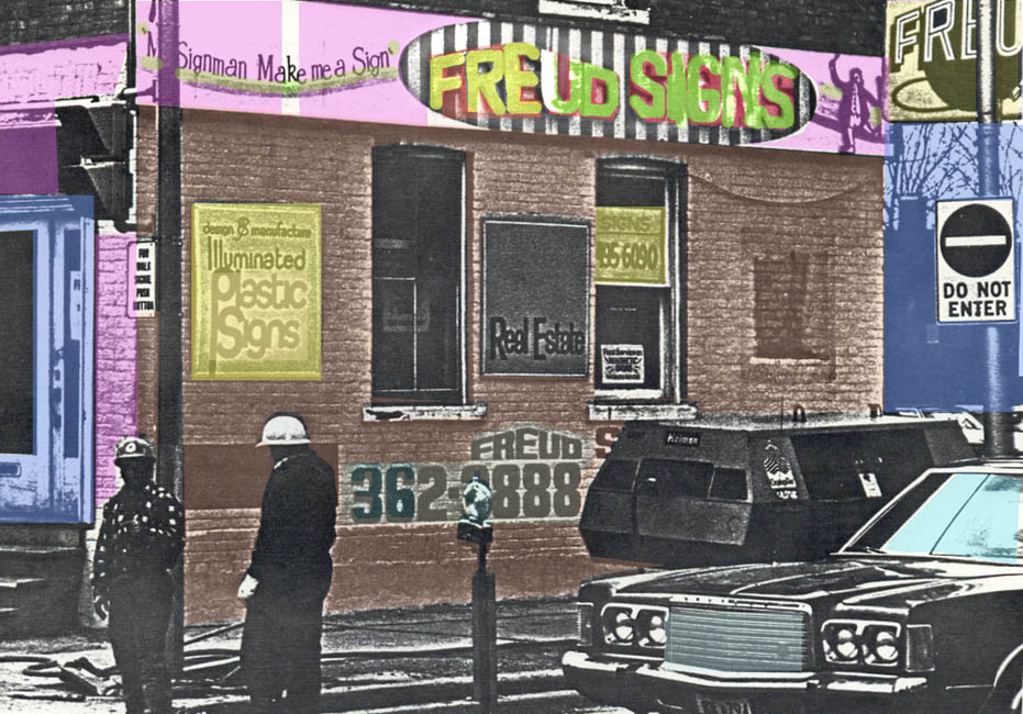
David Anderson’s recent exhibition of three films at the Funnel Film Theatre shows an innovative and effective solution to this problem. The first film that was shown, Mr. Signman, Make me a Sign, gets its title from a sign painted on a building. Images from advertising, particularly billboards, abound. But there are other images – construction on a street, a man lounging in a lawn chair, a boy and girl kissing on the sidewalk – and we realize that these are signs as well.
Anderson seems to be well aware of one of the fact of film – that what we “see” in a film is not the whole, but a series of cues or signs which we link together mentally. In the case of Mr. Signman, the thread of continuity is provided by the fact that each image carries a certain amount of weight as an archetype of some activity in our culture, but what prevents the film from slipping into being merely a catalogue of cultural clichés is a feeling that grows steadily during the film that there is a point of view here. This is not a re-hashing of clichés, but a long look at the reality behind them and the individual confronting them. An example is to be found in the glamorous photography of a billboard advertising Cool-Ray sunglasses. Are we not all secretly drawn into and seduced by such imagery? Yet Anderson, unlike Pop artists who have capitalized on glamour itself, shows the billboard situated across a parking lot in all its grimy city surroundings, and eventually replaced by an ad for something else. Not only are we given a look at our usual reaction to advertising, we get to see ourselves from the outside – vulnerable and oblivious creatures that we are!
Anderson’s camera and editing achieve a remarkable balance between the personal and the objective. Most of the film is shot from a single window in his studio, or else contains images which are visible from this window. We know that this is one person’s “view” of the world. And yet the film never once lapses into subjectivity. Explaining his attitude to film, Anderson stated, “I felt that if I can understand what this is,” and he smacked his palm against the desk to emphasize the ‘this,’ “then maybe I can better understand what I am. I started using photography because I thought it would be more direct, less interpretative than painting.”
Obviously, this is more than a superficial observation on the nature of photography. The intensive, investigative documentation of a specific environment serves to locate a centre, a viewpoint – either by process of elimination or by, in effect, plotting the intersection of co-ordinates – not only in Mr. Signman, but also in Bi-Rite and Five Birthdays.
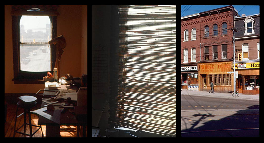
Bi-Rite is also a window film. The camera assumes a more or less fixed position for most of the film, and we watch from the second story of a building at the corner of Carleton and Parliament streets in downtown Toronto. Streetcar cables and wires obscure the view and occasionally a rattan blind is lowered and raised, adding another layer of concealment until only tiny slivers of light from the outside scene show through the maze of black lines which criss-cross the screen. Different times of year, times of day, and kinds of weather are shown, using various focal lengths and depths of field, with the Bi-Rite sign on the corner shining like a constant beacon.
As the film progresses, we are permitted some looks inside the studio – the artist himself, sitting on a bed, glimpses of some collages he is working on, and so on. Then a green summer garden, incongruously, like a dream of escape from a monotonous shuffle of everyday life past the Bi-Rite sign. Compared with Mr. Signman, Bi-Rite takes a more complex strategy in revealing itself. It is as though, by giving us an obscured view, or only glimpses of the interior of the room or the thoughts of filmmaker, the intensity of their power will be increased. Anderson established the long, hard look at reality in Mr. Signman, and again in Bi-Rite he invites the viewer to look and look again at what is really there.
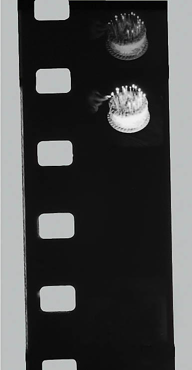
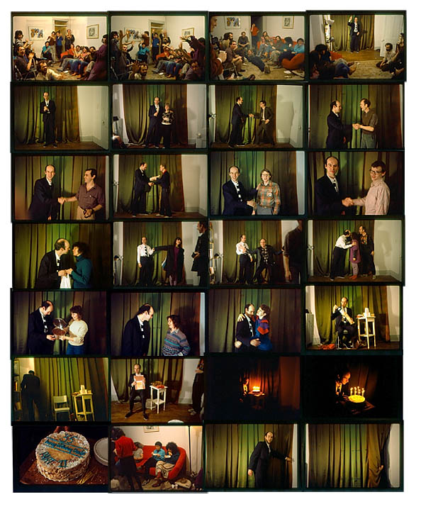
The date of the screening at the Funnel, January 23, was David Anderson’s birthday. Five Birthdays, as the title implies, documents the five preceding birthdays. Particular emphasis is placed on the birthday cakes. Time after time, candles are blown out and portions of cake are distributed to smiling friends on the screen. Five Birthdays records, not a place, but an event – the same event, again and again.
Unlike Mr. Signman and Bi-Rite, Five Birthdays uses sound as an integral part of its development. Ragtime piano pieces are heard repetitiously throughout – sometimes loud, sometimes soft, occasionally stopping in the middle and starting over. The music is at first light-hearted, but quickly becomes predictable and monotonous, settling into the background. Likewise the images of cakes are initially luscious symbols of fascination, but rapidly lose their dazzle when repeated. Behind the veneer, of course, is the passage of time and one person’s acknowledgment of age by the celebration of his birth. Film has a remarkable ability to manipulate time perception, and Anderson has used this to make a film about time.
Toward the end of the film, superimposed white titles appear over the cake and candle shots. The words are “HAPPY”, “BIRTHDAY,” AND “HAPPY BIRTHDAY.” At this point, Anderson, who was in the audience walked to the front of the theatre and began lighting the candles on two real cakes placed on either side of the screen. Then, out of the shadows another figure emerged, lifted a camera and began to film the ritual. The audience clapped and cheered – we had been included in the aesthetics of the piece. The film had laid a groundwork of time, and Anderson’s use of real time performance completed and closed the experience. He blew out the candles, and after the screening, treated us all to ice cream and cake.
David Anderson is a humanist. He deals with the film image by giving it a personal scale. This could even be seen as a rudimentary narrative structure, for although there is no story development, the artist assumes the role of either narrator or unseen protagonist.
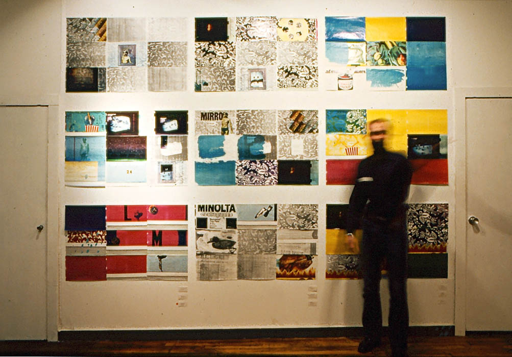
A brief comparison to an earlier show by Anderson this year – an installation of colour xerography at the Funnel Gallery, reveals more evidence in favour of a narrative framework for his work. The 8.5”X14” sheets of Xerox paper were pinned delicately in groups of nine each with dressmakers’ pins to the walls of the gallery. The predominant motif was a Xeroxed copy of a segment of wallpaper (witness to Anderson’s concern with immediacy in exploiting the cloning aspect of the machine). The comparison to film structure is apparent – groups of frames composing shots, with a common, underlying theme.
In one grouping of nine frames, not only was there the wallpaper design, but also a shot of a hallway papered in the same design, with a table and flower arrangement in front of it. Then, beneath the grouping, Anderson placed an actual replica of the table – pulling us in as he did in his performance during Five Birthdays.
Interspersed with the wallpaper designs around the gallery were images from advertising, shots of cars, building sites and so on, reminiscent of Mr. Signman. There were fragments of words, letters, and homage paid to Xerox in the form of pure Xerographic colours – cyan, sky blue, and yellow.
It is, however, the titles of the pieces which gave the first clue to the narrative form of the installation. Titles like Crossing the Great Water, Air, and Fire seemed to indicate some sort of spiritual journey with a repeated image of a skinny, half-naked man taking on the role of protagonist. The central piece, entitled Ascension, was the only work in the installation arranged horizontally, and showed this figure rising up, frame by frame into the air. The group that followed represented coming full circle – a return to the hallway and wallpaper. Without any actual story development, some sort of tale had been told.
The title of the gallery piece was Tenderness – a word with two meanings – loving and caring in one case, and vulnerability to pain in the other. These two intersecting definitions alone can be seen to locate the self, ever full of contradictions, in the same way as the images in the films.
In his films, and in the Xerox installation, Anderson, in placing himself, helps us to find ourselves. He is respectful of his medium, whatever it may be, and of the viewer.
On March 24, 1980, David Anderson’s most recent works, this time a series of paintings, opens in the Funnel Gallery. If he proves to be as skillfull and sensitive in this medium as he has been in others, we should see a good show.
A. Gronau 1980
