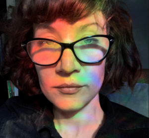
Monsters: an interview with Jenn E. Norton (2009)
Mike: I was recently chatting with a friend who remarked that the instance of female artists who were able to sustain a practice as well as being a mother was stunningly low. Such an old question and an old division, with art on the one side and life on the other. Do you feel it the same way? Did you ever wonder: how will I go on? And perhaps you might spare a few words about the first days after your miracle birth, the sleepless wonder of it all.
Jenn: It is interesting to respond to this question tonight at midnight. When my daughter awakes this morning she will have turned one. A ukulele wrapped in colourful paper and bows, baked cupcakes and my video camera, await her wild crazy baby arms to make chaos of decor. I love her madly.
To be perceived as successful in our culture, we are really pressured to pretend that we did not enter the world via the vagina, but fell out of a file folder ready to work. We are to keep our families invisible to be professional. Work work work.
While seven months pregnant, I was invited by Christie Digital Displays to work as an artist-in-residence and premiere a 3D interactive installation at CAFKA. I gave birth a month later, and brought my baby to every meeting, orientation, testing of the installation, interview, the premiere and closing. My partner was with me as well, and we were visibly a family.
In the high tech environment of Communitech where I was working, we raised eyebrows, and potentially pissed a few people off with the needs of a little baby, but at the closing reception people remarked how inspirational it was to see someone working against all odds. I was the first artist to be invited by Christie to work in their space at Communitech, and the invitation was extended to keep working there using a 3D drawing tool called SANDDE.
I don’t fit in. Like, ever. I was a skinny, shy tomboy that loved to read, draw and daydream. I came with messy hair, a jumble of bad teeth (I had conjoined teeth!), and bright red birthmarks peppered across my face and neck. I am very used to not fitting in. Having a child would seemingly be the wrong thing to do, if there was a handbook that guided one to art stardom or success, yet I am happy to say that I have had a very productive year, baby in tow.
Perhaps video and video installation lends itself well to women with children. I can work in the next room while my baby sleeps with headphones cocked slightly off to the side to listen for any whimpers or peeps. There are a lot examples of successful artists that are mothers, but I will admit that it is more challenging to complete work than it once was. Sleep is the elusive dream that seems to be reserved for other people. I need to continue my practice as an artist — it is part of who I am.
I had a very difficult labour which was described to me by my midwives as “violent” and “wonky.” Nearly a month early, labour began during a show I curated of Jean-Paul Kelly’s work. I left the opening, repetitively apologizing, as though I could control it. Labour lasted over four and a half days that brought us in and out of the hospital with intense contractions that were only minutes apart. My baby was positioned awkwardly and was stuck on my bones. Four top ups on the epidural, a third degree episiotomy and a pair of forceps brought my wee love into the world, bruised, cut and tired. With significant injuries, we remained indoors for the majority of a month. During that month I completed a two-channel installation with 3D CGI and created a surround sound soundtrack. The work, entitled Mirador, was exhibited at the Yukon Centre for the Arts shortly after. It was difficult, but I worked when she slept. My partner helped with all of the necessities like fetching diapers, food and all of the things we didn’t know we would need.
It is really, really hard, but life of course is full of challenges. I don’t wonder how I will go on — I am always excited for what is next.

Mike: The girl who looks like a boy, the dreamy drawer, the one who doesn’t fit in. Perhaps whomever is relegated to the margins of a room has a unique vantage that arises from what might overtly appear as disadvantage because this outpost allows them to see more clearly what is happening, instead of being swept up in the common sense acceptance of things as they are. For myself, I think I carried my parents’ traumatic world war experiences into a suburban upbringing, and the clamour of that collision created a helpful rift in the natural world. Am wondering if you felt something similar, if there are moments, anecdotes, instances you might point out, that signaled your outsider leanings, a personal mythology perhaps, a secret code that allowed you to bridge private inclinations and public necessities?
Jenn: Maybe the reason people become artists is because they have a unique perspective, or at least a unique way of interpreting perspective.
I have a proclivity to pathologize everything, particularly when it concerns curious decisions that I don’t understand. I attempt to find patterns in the illogical or random. Recently, I was researching why children have imaginary friends, as I had three and wanted to know if this was a psychological anomaly or predicated neurosis. Apparently it is not atypical, as 66% of healthy-minded children have them in order to understand emotions brought forth in their expanding world. I romantically think of them these friends as reverse psychopomps.
I grew up by the railroad tracks in an area that was transformed from farmland pastures to a low income neighbourhood. Goats and sheep were replaced with backyards littered with stained mattresses and beer bottles. At night, drunken neighbourly fights often broke out on our lawn, while daylight found them with their mouths open, awestruck in appreciation of their latest litter of Rottweilers. Our sweet next door neighbours were mentally challenged and would kindly bring us food that their endless succession of dogs (all named Mork) would not eat. It was an act of generosity, even if it was unnerving to receive Mork IX’s rejected pail of vegetable soup.
I was anxious.
My dreams were filled with the clattering sounds of trains, a claustrophobic frame of black machinery filled my sleeping view. My parents kept gardens framed by a white picket fence, Sunday was mass, Thursday was catechism, and the parish priests came often as dinner guests. My parents taught us to be analytical when considering media, to exercise a critical voice in political discourse and to express ourselves creatively. But I could never shake the guilt and fear instilled from the notion that hell was very real and most definitely attainable.
In addition to the local environment of tracks, trash and the trinity, the Chernobyl disaster occurred when I was entering elementary school. A somber, in-class presentation comprised of colourful felt-tipped markers and newsprint illustrated our proximity to the nuclear power plant. Bright rings represented the areas that would be affected by the radiation should there be a meltdown. We would not die immediately in the explosion but would become sick from radiation fairly quickly. We wearily brought signed permission slips that granted the school authority to administer iodine pills in case the apocalypse should arrive.
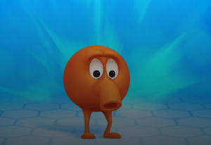
My imaginary friends were phosphorescent, furry, triplet male monsters. They didn’t speak, nor I to them. We communicated psychically, although I am sure that I was not familiar with that idea. I appropriated Q-Bert, the fraternal facet of the trio, from the eponymous arcade game. The other 2/3 of the trinity were Up Lips and Down Lips, who were identical twins with opposing dispositions. Q Bert, my best friend, was the monster that I brought to dinner, while the twins stayed in a world beneath my bed. With them I could share my happiest and darkest thoughts and ideas without fear. They were my secrets, too special to share with others. If anyone saw or knew of them, they would spoil like emulsion exposed to light.
Q Bert became the joke of the family. One day I dragged Q Bert through the kitchen, my tiny frame burdened by his weight. Amused by the pantomime, my family asked what I was doing. Solemnly, I answered that I was going to bury Q Bert under my bed. He had died of cancer. It was alright, though, he was a triplet and they are all the same guy anyhow. I had taken experiences and concepts beyond my comprehension (nuclear fission, crisis, mortality) and created a fractured identity that reflected my varying feelings towards them in a way that I could understand. They were friends. Together we enacted a performance that turned the overwhelming into the manageable.
I still have imaginary friends. They might not have names or bodies anymore, but they are entities I create to usher ideas, address issues, interests, quandaries, queries, curiosity and ruminations into a form that I can visually share with others in a meaningful way. They are devices, structures and constructs, landscapes and characters — all crafted to communicate ideas that are better felt than told. Like the imaginary friends children use, they are constructed intuitively, but are given parameters. They are assigned formal attributes (in my case, furry monsters) and limitations (they cannot talk or exist outside of my room). If one strays too far from the initial boundaries, meaning is lost.
When I am making video and installation work, I often begin with a set of rules that I must abide by. Finding the possibilities within that context shows me how a piece functions, how it operates. Otherwise, the work becomes formless, a floating blob of personal experience. Once I understand what type of structure I have outlined for myself to work within, I feel that I can be imaginative, intuitively engaging, while providing entry for the viewer. I can play with the technologies I am using in an improvisational way, collaging and compositing, learning how to use them as I go along, so long as I adhere to the logic outlined.
I appreciate artwork that I can’t entirely pin down conceptually, where there is room for me to become an active agent in pursuing an idea, allowing my mind to turn a conundrum over and over again to try to see its logic. There is an introspective sensibility in my video work that often manifests itself formally within self-reflexive structures. While the themes and issues addressed exist in a greater context than my own experience, I approach them from a very personal perspective.
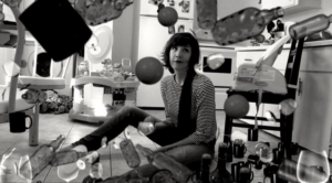
Mike: What you write is so touching and germane. What else is a piece of media art but another avatar? And while our movies have been rarely described to me as friends, they have certainly taken on the attributes of lovers, task masters, memory repositories, grieving vehicles. If a work has roots I think it needs to come from that place under the bed, where all that is unspoken and forbidden lies waiting to be given form.
To make friends out of our monsters, instead of trying to kill them, this seems a stark reversal of a long masculine literature of heroes and their labours. The pact you describe between yourself and the impossible, the overwhelming, the diseased, the unbearable, occurs outside the prison house of language. Is that because language comes after experience, as an afterthought? Do words always arrive too late? (You said that if you took Up and Down Lips from the bed they would spoil, like exposed emulsion. If they could converse, if they would be dressed in words, would that also cause them to spoil?)
And yet you were able to say to your family that Q-Bert had died of cancer. Such a heavy word for a child to say. I’m wondering if there are artworks that could be made that would be similarly private, a video installation designed for a single viewer? In this moment when our media tools are making us transparent, when we are busy self-broadcasting via portable telephones and interwebbed uploads, is there still a place where we can hold our unspoken fears? Is that the space of art, or are those gallery confines too rarefied, still humming to the rhythm of all those difficult words?
Jenn: Monsters, in the context of mythological beasts, are alluring. Their grotesqueries, strangeness, and elusiveness are somehow easier to understand than human cruelty.
My remaining monster friends did die, or rather they receded into nothingness when I eventually spoke of them. They lost their potency, their power, and became a novelty, a joke amongst adults who would humour my descriptive recounting of our friendship. Through words, I lost the emotional repository where I poured extremes into. I began to act out death scenes at inopportune times, during swimming lessons, at school, birthday parties, and church. At catechism I would turn church songs into violent dirges in which I would mime cutting my chest open, sputtering imaginary blood through the words of “Into my heart Lord Jesus.” The nun’s once immovable patience proved to be finite.
Although my friends are lost to me, revealing them in this context, right now, feels like a betrayal. Maybe this should be a redacted text with black bands to protect their names? I am telling you about them as they reflect the part of my creative process that I do not share, the part that can’t be quantified or rationalized. Things that are sacred are flattened when dragged through ill fitting translations, especially when an individual has determined their own belief systems or myths. At times, art can suffer, too, when everything is given up, laid out, tethered forever in the viewer’s memory to the lengthy text of a self-conscious didactic panel. We try to translate in order to be understood and to share experience. Although installation cannot be documented in a way that accurately conveys the phenomenological aspect of a work, we find ourselves doing it all the same for the sake of posterity, dissemination, and for the accessibility of a broader audience.
But we never become transparent, never truly “give it all up.” We can’t convey everything through language, and we don’t show everything, either. You mentioned broadcasting our lives via communication technologies or online social sites, which do reveal many personal details, but it has also made editors of us all. We are constantly framing, relegating expository dialogue to comment boxes, concealing by pointing to or featuring a particular moment to make public, while keeping other moments to ourselves. It is not a new concept, yet in recent years it seems we have more selves to care for than we once had. Our corporeal and digital selves are busy sharing the finite hours of a single lifetime.
Video tours, online photos and print documentation are the vehicles by which installations are seen by most, therefore most will never truly see it. Perhaps every installation is made for an individual viewer, in that perception is dictated by our idiosyncrasies, the way we uniquely navigate through a space and sequentially unfold information. One viewer may listen to an installation more than see it, while another may hear sound peripherally. This is the personal lure of installation. Although this occurs in other media, there is nothing so all encompassing as installation, in that everything in its engulfing presence becomes contextually linked. Perhaps this is also how memory works. To wrap this type of viewing experience in words is only an introduction. To fully deliver that experience through translation is impossible.
Mike: What I hear you saying is that the experience of each work is singular and finally wordless, unshareable. Art is located in public but occurs in private. There is no way an artist can know how their work is received, and perhaps no real way for us to communicate our deepest and most important experiences to each other because all we have are the insubstantial pointers of language. And what better place than an interview to explore the failures of speaking? I think you’re suggesting that art is a way we might share our formative/primal experiences, it is part of a social exo-skeleton that occurs before and after language, a medley of feeling tones. Does it worry you that so much art is absorbed by fellow artists and insiders? That it often functions like a private member’s club, with secret codes and avant garde traffic signs. Does the question of accessibility rub at you while you are in the making?
Jenn: I don’t think it is unsharable, though our ability to verbally transmit the experience of looking at art is finite, particularly work that is time-based. The role of artists is to convey ideas creatively and to pose questions from a unique, transportive platform. Using means of communication that exist outside of our everyday tools, or challenging them in some way, allows us to consider preconceptions. The act of seeing is a creative process; engagement necessitates this. While I believe we cannot fully explain the strangeness that occurs when we experience the uncanny, for example, I think we should try. These experiences are intended to push us from a familiar position, into an unknown — the discourse that follows pushes us further still.
There is an imaginative place we draw from that is built upon interpretations of experience and memory, yet this is not at the forefront of every artist’s practice. It is for me, although I do not consider myself working within a surreal or a wholly autobiographical methodology. I am invested in the materiality of film and video (and lack thereof), its history, its production and how video is evolving as a predominant language within our culture. In fact, I don’t think that I have ever made a video piece that wasn’t about video. I think that these themes provide structure for the intuitive and emotive aspects of my work to move within. The fantastical imagery is often a device that directly addresses the tropes of video, both in content and technique. By lying to the viewer with illusion, I am showing the truth about video. The deception of video is beautiful and mesmerizing, adulterates our memory, which in turn shapes our history, personally and collectively.
Accessibility is an important consideration to me, but only to a point. It is a disservice for everyone to censor an idea for fear of inaccessibility. I hope a piece can function on different levels for diverse audiences. I admire artists that achieve this without seeming to be deliberately populist or sacrificing the integrity of a concept. Work that is engineered for a niche audience equipped with a specific reference is rather one dimensional — although, inside jokes are pretty funny, if you are on the right side of it.
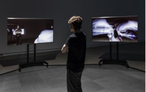
Mike: A thousand years ago I shared art school yields with my mother who looked on with patient, indulgent incomprehension. She had no tools to unpack the difficult formalisms I was enamored with back then. Then? Gamely she offered, “Oh, this is a film for other filmmakers.” How very right she was. I guess I’m wondering about the non-artist, just plain folks part of our lives, and how your work might connect or not with that audience. Do you ever show your things to people who don’t have a deep background in postmodern video medicines? Does the non-specialist response matter? Is there some way you try to tune your inner compulsions to the eyes and ears waiting on the other side? But perhaps you work in splendid isolation, gathering and sorting without friendly feedbacks?
Jenn: I completely empathize with this. Contemporary art was not part of my upbringing, so I was sensitive to the perceived strangeness and elusiveness of it. In art school I rarely showed anything I made to people outside of the walls of the Ontario College of Art. I was afraid of the awkward moments that arose from the collisions of worlds, the conversations that prematurely shut down when someone felt that the work was outside their frame of reference. I thought that if someone didn’t get it, I was clearly not good enough as an artist and simply had to work harder to bridge the gap. And I did work harder — too hard. For quite some time I went out of my way to create work that I thought was accessible, using humour as a sneaky conduit to usher in serious issues. However, guessing the reactions of imaginary audiences on either side of the gallery stanchion crushed my ability to complete anything, and “funny” wasn’t always appropriate. In this impossible mission to reach all, the work suffered.
While completing the demanding production schedule of a Master’s program I had to work through the anxiety of trying to be everything to everyone and dampen the choir of possible ‘huhs’? The time constraints simply wouldn’t allow hesitation or toddling and I had to run with my ideas. I felt naked showing work that I hadn’t mulled over for years, but not putting the audience first was kind of liberating. My process has become more honest as my practice has become more introverted. I am generating meaning and content rather than packaging it.
The recent residency for my Tesseract project at Communitech with Christie Digital really did put the working process on a public stage. People with a commercial background were toured through my working space throughout the day and had a lot of questions about what I was doing. To work in public was something that I had never done before, and it was intimidating, but it informed the decisions I made, which was particularly important for this installation as it was about perception. For Tesseract, feedback was invaluable.
YouTube is wonderful in some ways. Although the comment section is rife with the most depraved critique, it also reveals that there is a broad and diverse audience for experimental media and I find this heartening! People are willing and eager to consider video/digital art. Maybe, like many of us (myself included), they just need time to ponder and wonder to form a response.
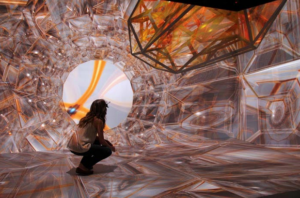
Mike: Tesseract looks like a controlled explosion of glass taken shape as architecture, an immersive cave requiring 3D glasses and a moving viewer. Traditional art speak distinguishes between figure and ground – bathers by the lake for instance – but here the viewers themselves seem to have become the figures, while the art on show, customized for each experience, is a constantly shifting ground. Can you describe the project and perhaps talk about the way it shows what can’t be shown? Is it a bummer that you can’t pick it up and run it in a friend’s living room, that its public life has a necessarily limited embrace?
Jenn: I like your description of it. There are aspects of it that are informed by architecture as it was an offshoot idea of a site specific project. The original site was Kitchener’s City Hall, a building that has a section affectionately referred to as The Cube. This cube perched atop a tower has become a screen in which artists are regularly invited to project their videos. When I was invited to produce something for it I started from a fundamental position — just the shape itself, and wondered what could be interesting about a cube. In considering how to animate it, I thought about folding the building in on itself infinitely by using a trompe-d’oeil style of projection, or projection mapping. I realized that this idea was stumbling towards hyperspace territory. A cube in the fourth dimension is a tesseract, or a hypercube, which, in illustration, has an aesthetic that I found beautiful, even hypnotic. A tesseract is a formula for a geometric form that we cannot see because it is a four dimensional form, and of course our eyes are stuck in three dimensions. The hook for me was that we can imagine what it looks like by using analogous forms, projections that are guided by notation, translated into imagery we can comprehend.
In a wonderfully humorous yet explicative segment from Carl Sagan’s Cosmos television series, he illustrates how we can see or imagine a hypercube in the third dimension as a shadow of itself, but it loses its accuracy in the shadow’s projection. Creating a form to visualize something that exists beyond our sense abilities is a creative act, and an interesting one at that, as we know the execution will always be inaccurate. I am not a mathematician and cannot make sense of notation, so I researched the form of a tesseract via the illustrations of others, offering an adaptation of a translation. It’s not an illustration of four dimensions into three, but an imaginative place of discovery. The lie, the illusion, is what gets us closer to understanding a truth that evades us.
The installation offers the viewer a translation, it gives form to the invisible. The viewer is able to dictate the perspective and proximity of the structures in the video signal by using their gaze, as the sensors track their movements. By looking, they create a customized sequence of images from their point of view. Those not wearing glasses can see the observational decisions the initial viewer is making, but they can only see a skewed anamorphic version. In this work, seeing is performative.
It is a total drag that this work can only be shown with a crazy amount of technology and calibration — I want to show it again and I want to see work made by others in this medium. (Sigh) There are CAVE’s peppered around the world. Maybe it will become more common?
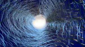
Mike: I wanted to ask you about your geek technical life and being a woman. Hardware wet dreams are usually the hopes of men becoming boys, and yet you have thrown yourself into video’s secret codes and wires from the very beginning. Is it too awful to ask why? To risk using a crude language cudgel: the old divide in the media art community pitted film formalists against technically relaxed, content-driven videonauts. But there were always some folks (like yourself) committed to video’s forever shifting technologies. Can you talk about your ongoing love affair with the materials of this most immaterial of all mediums?
Jenn: The divide between film and video is there, and it is a gaping one for someone like myself. I do not feel at home with either category and fall through genre gaps. But where I land is a mutable ground, and it’s where I belong. Its elasticity is generous and I greedily stretch it. Having no ties to dogma grants creative freedom, but it also means that there is not a prescribed audience. I may never land gracefully before a gregarious audience, but I know that, at times, I am experimenting. Though “experimental” is a tag that is used perhaps too loosely in naming art processes.
I genuinely enjoy using technology, I follow online tutorials pleasurably and adore mashing them up with disparate techniques I have culled from similarly disparate places. Sometimes when editing under a deadline, particularly while freelancing, when I am stressed out with worry and fatigue, I am surprised to find that I have an unconscious smile spread across my lips. When I am in the thick of compositing, at times hundreds of layers deep, I am on the edge of my seat, shoulders scrunched up to my ears, eager to get to the next step to glue all the elements together with a virtual light or camera. Nothing makes me as happy in my work as when I am testing a new circuit and, voila, it works! Because electronics have always been a challenge for me, I feel truly satiated when the sequence of trial and error finally ends victoriously.
I forget that it is considered a masculine endeavor to experiment with gear and gadgets, until someone points it out to me. Perhaps time is truly forgiving, as I think about it less than I once did. These days I don’t have to deal with gender politics in my workplace, which is populated by myself and my cats, who are perfect gentlemen. But I would be remiss to suggest I haven’t had to deal with it in the past, and anticipate that I will have to again in the future.
I need to work, to make things, or I grow anxious. If I work alone I only have to wait for myself and the speed of my processors. It has been difficult to work with people that are conservative in regards to production processes. It seems that people like to keep delegated roles specific, whereas I like to spread myself across the production spectrum, turning from soundwork to editing to animation and then back again. It would be torturous for me to be limited to one aspect of production as they are all parts of a whole.
I am lucky to count amongst my friends women that share my geek-ish drive, but we are all artists, therefore represent a marginalized demographic. Women have always inhabited important roles at the forefront of cinematic, video and computing technologies, yet I must admit that I am surprised to see so few women on the online forums I frequent when trouble shooting or researching. Maybe we don’t leave digital footprints via comments posted for posterity, preferring instead to move quietly through information? Why is that?
In school, and when I was working in commercial video, I felt frustrated that people wouldn’t listen when they were stuck with a technical problem that I knew how to fix. After bearing witness to much gear-headed posturing, I would just physically move in and resolve the issue rather than raising my voice to explain it verbally to my peers. When I worked as a video technician or instructor and would assist in resolving persistent computer issues, I would often hear dudes say defensively, “I did that already. It didn’t work.” I would reply, “Hmmm, maybe it worked for me because this computer has a crush on me.” Sometimes absurdity gets the point across.
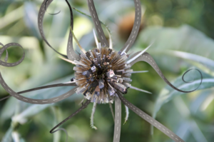
Mike: In Castles (5:20 minutes 2012) a single beach shot shows a small sand castle, and inside there is you and your partner and new baby making house, before a large wave comes and leaves only him. Lost and alone in the sand. And then at last an even larger wave arrives and all living traces are vanished. The family appears so fragile here, beset by forces well beyond their control. Birth and death are so very close. Can you talk about this dollhouse of a movie, and if the change in scale was in part the result of your new child who might seem big and small, so helpless and reliant, but at the same time — what was the word that Winnicott used — ruthless, in her (his?) assertion of needs.
Jenn: Castles wordlessly narrates the fear of a lost dream. “House” or “home” is a stand-in for inherited ideas and a sense of self. These preconceptions become increasingly precarious, as the delicate architectures erected in unlikely places suggest an immanent demise. In tandem with the castle melting into the sea is the sense of one’s self giving way, the obliteration of identity, expectations, and origin. The ephemerality of the material betrays its form as a turret, something that would traditionally be built with mortar and stone, constructing a representation of hubris, rather than a reliable foundation.
Having my family lost to the tide functioned on several levels. In one respect it directly addressed the deterioration of “home” in America. We watch a wave sweeping away a symbol of kingdom. The housing crisis that arose when the market crashed in 2006 with its foreclosures, evictions and unemployment, was terrifying, yet seemed to be a logical outcome of an inflated, unsustainable economy. It revealed the profit-first motivations of the banking sector, and showed us again the effects of a class war disguised by myths and pictures of equal opportunity and white picket fences. If the American Dream was lost in the wake of this crisis, it revealed the crushing force of multinational capital, and its predatory, ruthless qualities.
I visited New Orleans shortly after Hurricane Katrina ravaged the southern states. We drove from Toronto and the transformation in the architectural landscape was astonishing. It had been a year since Katrina, and the highway looked like the apocalypse had passed through only days earlier. Initially I entertained a voyeuristic fascination in documenting sky-high Walmart signs toppled over, simplistic views of fallen capitalist monuments. The drive delivered us to the subdivisions on the outskirts of the city that appeared to be inhabited, but closer inspection revealed plywood-covered windows and doors marked with trauma. Spray painted digits signaled to elusive rescue crews the numbers of victims inside. We walked through some of the inner city neighborhoods and were shocked that they echoed what we had seen on our drive. They were just a few blocks away from the tourist-filled French Quarter, but the government has left the houses to rot more than a year later as a horrific unresolved epitaph.
Castles represents the fall of an empire. Perhaps they are all fated to end, but one made of sand lends a dramatic irony. “No Place,” the title of the exhibition it is currently housed in, is the direct English translation of the Latin word “utopia.” While I didn’t initially want to be so direct in the show’s naming, its meanings multiplied over time. “There’s no place like home” is the mantra that brought Dorothy back from Oz to her Americana homestead. Her dream for home was with her all along, but where is home when the welcome mat is pulled from underfoot? What if home no longer exists as we used to recognize it?
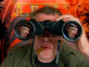
Mike: Transfer Station (24:24 minutes 2007) is like watching a year of TV in 20 minutes. Its syrupy surfaces blend one product into another, each personality as replaceable as detergent. It’s a clean, ageless, teenaged forever land out there, every edge rubbed smooth so that nothing will ever hurt again. Special effects appear not as accompaniment, but a way of life. “Welcome to Panoptiscope building a customized reality.” You arrive as teen video star Cherry Pop, summoning dancers for a pre-concert prayer scrum, the artist known as Kunst strikes a bloody pose in interview cutaways, while religious dial ups wait for audience calls. What led you to this postmodern playground, and why the reflection on TV? I can’t help but imagine that you are in such a different place now than when you made this movie. (Who has time to watch TV, for instance?) What would you say about the person who made this?
Jenn: There is a great comic strip online that succinctly illustrates my thoughts while creating Transfer Station called Amusing Ourselves to Death by Stuart McMillen, 2009. McMillen looks at our society by comparing the dystopian novels Brave New World by Aldous Huxley and 1984 by George Orwell. The first comparison reads, “Orwell feared the truth would be concealed from us. Huxley feared the truth would be drowned in a sea of irrelevance.” Transfer Station errs on the side of Huxley’s nightmarish vision.
What began as a fun project soon turned into a mischievous, thought poltergeist. I began shooting Transfer Station in 2003, thinking it would be a light-hearted, satirical character study of an aspiring pop star, something that a group of nerdy video friends might do over a weekend. I just couldn’t get over the celebrity culture garbage championed in mainstream media. It was such an obvious distraction from the horrendous events of the turn of the millennium and people were actually enjoying it — literally buying into it! Somehow, inventing a character that embodied this led me to Transfer Station, which needless to say, was not the character sketch that I had I hoped to complete over a weekend, but spread like an atomic, schizotypal, video bomb.
In 2003, my graduation year at art college, conversations about popular culture made clear that my ideas of feminism were challenged by some compelling arguments. I had always thought that in order for women to attain equality, we should be studious, and excel in our respective professions, rather than use our sexuality as a strategy to garner power. If one women was objectified, I thought, even if she willingly did so in a manner that benefited her financially, personally or emotionally, it would set the rest of us back, painting us all with the same regressive brush. Perhaps this wasn’t the whole story.
The inception of Cherry Pop may have come from a didactic, binary position, but the wrestling match I was having with myself resulted in something more open-ended. The concept of sexuality as an intrinsic part of our identity was at once more complex, and possibly more simple, than I had considered.
The question of agency surfaced on other levels. Much of the video questions our role as viewers, consumers and producers of media within a capitalistic society, and the cyclical structures of influence. The initial enthusiasm to build a video character study became a meta-narrative describing vertically integrated economies. Years passed while I slaved away on this video, my head and heart grew heavy with worry as I questioned my beliefs in a power that could be mapped onto an evil media mogul grinning from a penthouse suite, rubbing his hands together before he pulled the strings that control us all. This lone villain perched atop a hierarchical throne regressed into the multitudes of wrong, and an existential fog settled upon my argument. Who is to blame? This manifested in a mash-up of commercial media from a fictional communications conglomerate that illustrated the stages of social submission and pacification through media.
Transfer Station begins with the suggestion that the viewer has recently subscribed to a company called Panoptiscope. All transmission of information, including television, internet and phone service, is provided by this monopoly. Much of the video appears to be a legitimate commercial entity until the narrative reveals what is outside of the frame: the television set and the viewer floating in a wasteland of technology. This junkyard space transmits propaganda disguised as entertainment.
There is a push/pull that occurs throughout the video; there are no unmediated realities within it. The moment we believe we are finally seeing the set, or where this narrative is taking place, we realize that we are watching it on another television set. There is a forever-ness that is nightmarish in spite of its absurdity and cartoon nature. There is no ground to find footing as a viewer; the video is awash with disorienting transitory scenes, all familiar, yet alien and endless; a wormhole of false-realities. The camera that travels through the illustrative junkyard and programs is virtual and weightless, offering scale-obliterating perspectives.
As the video progresses the actors become warped and morph as though they cannot sustain realistic representations, as though the similitude is so elasticized it fails to serve its purpose. There is a sense of stress, of tension, within the non-space that these characters inhabit. This non-space devoid of horizons raises questions in lieu of answers, perhaps evoking a sense of searching.
The video rattles along a transformative trajectory that turns itself inside-out, like a Klein Bottle, or a Möbius strip, so as we stumble through the fractal/bramble of antiquated TV sets we come upon the lie through the medium. I played it on local television in vignettes, like it was just a part of regular programming. In critiques, the first question I would get is: why haven’t I done anything to the footage I recorded off of the TV? I would have to tell them awkwardly that I hadn’t recorded it, I made it from scratch, in my living room. For the more expansive scenes, like the Cherry Pop concert, I shot it at the circus that I was working for. In other words, I pieced it together with what I had access to. But it did look just like TV. The re-injection of Transfer Station, and other video work I made at the time, back onto TV, completed the gesture of their makings, as if they were feeding back into the structure that had spawned them, though they had deviated from their source material, like a virus in an organism. I was struck by the cannibalistic influence between corporate and independent media. The notion of the passive relationship between viewer and producer of mass culture as non-reciprocal — the television broadcasts but does not receive information — is incorrect. The screen’s social divide is false, the individual does affect the media, as a viewer or as an independent producer of content.
But… I thought that I was reconstructing the aesthetic of television and subverting it through absurdity. People couldn’t tell the difference, no matter how weird I made it. I realized that there was nothing as absurd as television is already, so why bother? The motivation to continue building this expansive fun house of post-production was also a deterrent. I became disillusioned, even repulsed, with video as a medium, and in turn the cinema and television I had grown up. What lay in question was my identity as someone that wanted to be a creator of illusions. Why labour over illusions?
The video segments couldn’t be completed quickly enough to keep up with my ideas for it. The meanings that wove in and out of each segment was fed from an endless spool of intrusive source material; advertisements, television in bars, radio and internet pop-ups. I felt mentally ill for paying attention to all of this, and I didn’t want to make work that was extraverted any longer. I longed to make my own structures, speak with my voice, not to react to outside constructs, or to speak in tandem, but to offer difference. My difference.
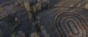
Mike: Mirador (13:25 minutes 2011) features a series of aerial shots that traverse forests and fields, canyons and coastlines. It’s shown on a pair of upended monitors that kiss, and the pictures appear in ovoid masks. Everything human arrives as scar and intrusion: roads, farms, houses. Are you pitting the natural world against human constructions here? Why the above-it-all vantages where everything appears as design elements? And why the series of strangely appearing animated cut-outs that tumble through the sky: a kid’s slide, a ferris wheel, furniture remnants? What does the title mean?
Jenn: One channel is aerial footage shot from the wing of a plane departing from Whitehorse to Dawson City, the other channel is a shot from a couple of hot air balloon rides over the Kitchener/Waterloo area. It never ceases to amaze me how much land humans have claimed, carved up and leveled. We are physically so unassuming, yet our footstep is so monstrous. We consume and dispose of so much. Much of the earth’s land looks like interrupted quilt patterns with a design that is determined by what can be extracted from each patch. This is best seen from above. This patchwork is hidden when looking towards the horizon by the vertical features of the landscape, such as trees, towers and buildings that collapse depth.
The title, “Mirador,” means lookout point in Spanish. It is a place to look out at a grand vista, a place deemed forever beautiful and marked out for tourists to see. I find the coin-operated vantage point endlessly hilarious. It is like a prop from an absurd comedy skit about privatization — look here, a slightly telescopic, poorly calibrated view of what you are already looking at that is sure to please. I came upon the term when living in Mexico and thought it was beautiful. I couldn’t separate the phonetic similarity of mirador and mirror. Because the view (an abstract idea in itself) was officially designated as beautiful and marked by a guardrail and/or signage, it recalled the perspective of a wanderer long since past. We re-enact a feeling of wonder that someone experienced long ago with a vista that may be radically different through vegetation, agriculture, or development or very much as it once was. Over time untold numbers of people mirror the position, posture, gaze and even appreciation of a place because of its status as a site of magnificence.
A few degrees to the left or right are not part of the mirador, not part of the invisible frame that houses the picturesque.
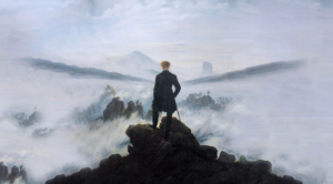
Whenever I come to a lookout point while traveling I think of Caspar David Friedrich’s painting Wanderer above the Sea of Fog. It is curious that his paintings somehow evoke the sublime, whereas other paintings of a stormy sea or sunset hang on a motel wall. I wonder if it is the empathetic viewer that stands on the edge of safety and oblivion that allows us to feel a touch of the sublime (or at least, I feel a touch awe when I look at his paintings), yet the motel paintings make people laugh, or roll their eyes. I giggle with appreciation of their kitsch.
Mirador is a take on the Romantic Grand Tour, an adventure that leaps across the Great White North via video, which makes the leap a passive one. We receive imagery that calls upon iconic signifiers of the sublime, yet, it is just too damn easy as it washes over from the perspective of an armchair. It is not sublime, it is leisure. The animations that jump between the screens are objects of hobby, pleasure, relaxation, such as the couches and La-Z-Boy chairs, the dice and jacks. The picturesque illustrated the coming-of-age travels of the bourgeoisies as heroic encounters with wild lands, but what we receive in this video rendition arrives with such ease that it becomes leisurely.
The immense scale, and the slow movements of the animated objects and ominous accompanying soundtrack echo the “grandness” of the landscapes, yet they are comically not grand. The rug patterns that appear to be made from wheat fields suggest that the land has been claimed as our living room. This great big space is ours to enjoy, to take pleasure in and from. This becomes perhaps more poignant when we see the actual scars of the landscape that are the results of mining, urbanization, transportation and farming. It is kind of an inverse play with scale from the rest of the show. As I am typing, I am becoming ever more aware of how much shifting the scales of objects and performers work as a recurring metaphorical device, questioning how we see power and authority. Or perhaps it is the fantasy of challenging that power?
When I let my mind wander on walks and hikes I see cities in natural forms everywhere, and if not cities, at least dwellings. I don’t know why I do this. I want to see something resembling human lodging in the tiniest natural infrastructure, down to the fractal level. Maybe seeing how natural structures can be used as a dwelling is in keeping with how humans have a proclivity to consume, and even my daydreams are culpable.
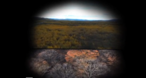
Mike: As an artist it seems you are reconvening moments in your digital computer studio and changing scale so that we can feel them again. Wee Requiem (6:52 minutes 2010) begins with a dead mouse in the middle of your living room floor, and this death provides the cue for a fantastical grieving assembly. A tearful congregation, including you and your partner, appear newly shrunken to the size of the corpse. Your downsizing appears as an act of identification, a necessary prelude to grieving, an embodiment of compassion. Can you dish about how you went about creating this scene and why you take the mouse’s death so personally?
Jenn: I found that mouse on the floor of Trinity Square Video (an artist-run centre dedicated to video production). It was early on a Saturday morning and I was the first one there as I was preparing to teach a workshop about composite editing. The little mouse lying there looked pretty fresh. I wondered if it was still alive. Once I found a fallen goldfinch that had struck a window and made a shoebox coffin cushioned with tissue paper to bury it in. It had been still for a long time and I was fairly certain that it was dead, but I couldn’t bring myself to place it in the earth. I placed the shoebox in the bough of a small tree and let it be for the afternoon. When I returned to check in, it was chirping in the branches above. I was hoping the mouse would do the mouse equivalent, so I left it there all day, much to the repulsion of the workshop participants. It grew more bloated as its fur became infested with little white insects. Yes, it was dead. After the workshop was over, I took a coffee cup, cushioned it with tissue paper and intended to lay it to rest promptly, but was saddened that it wasn’t going to be as lucky as the Lazarus finch. I felt so sad for the little mouse. It was ridiculous, I know! People hate mice, but I always did have a soft spot for underdogs, lone wolves and ailing creatures. I felt terrible about sending the mouse off to a massive garbage graveyard in Michigan in a coffee cup. I wanted the outcome to be different. This called to mind the many moments I wish I had the power to strike a cosmic undo button. I had the video camera I used in the workshop handy and thought of how it could change the outcome. Not only was pressing record my way of lighting a votive candle for this little creature lost, but it was an opportunity to explore an idea that had interested me.
I then shot myself, my pets, the pets of friends, my partner and family in front of a green screen and scaled us down to be present for the mouse’s funeral using After Effects. Our new sizes were not constrained to our actual proportions — a toddler was the tallest of the human mourners, save for that of the giant set of legs and feet. A tuxedoed Chihuahua towers over us as we solemnly stand around the mouse, and cats lounge larger still. I placed them huddled about the mouse with 3D-modeled altar candles and text that visually narrates the piece. This involved a lot of masking, chroma keying and frame by frame editing when motion tracking failed to secure an anchor point in the shaky camera movement. Virtual camera movements, lights and blur effects used to simulate the right depth of field helped glue all of the elements into a shared space.
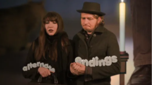
If you see a funeral for that mouse, even if it is clearly manipulated, you bear witness to the event. In a way, the mouse funeral really DID happen. Every time Wee Requiem is played that mouse has another funeral, and everyone who sees it will have a memory of mourners reflecting on its passing. Sometimes I think people are disappointed when I explain that my work isn’t all whimsy, or emotive gestures laced with longing for psychic dreams. This video is, above all, about video. It is about what recounting an occurrence with video does to our memory, and our perceived history. My video seems sweet, and it is, in a way, but there is a subtext that belies the sentimental surface. Using a personal approach, the text actually describes the video’s subtext. It is my perspective, they are my words, and I am disclosing everything to the viewer: that this is not really how it happened the first time around, it is an illustrated fantasy for a different outcome that we can achieve through video.
Pictures create memories that we didn’t encounter directly. For instance, my immediate mental recall of September 11th is a shaky, low-resolution video of the Twin Towers, seconds before the plane, the moment of impact and the billowing plumes of smoke that followed, shot with a handheld camera. What I am talking about is not specific to catastrophes, just video itself. In turn, it can affect something we have lived — the home video is an archival medium that reshapes our firsthand experiences into a singular perspective. Every time we review the home video it eats up the initial memories that we generated, replacing it with a prosthetic one. I am taking a small moment in my life to look at something that is much bigger than me, and my mouse. From my microcosm, I am looking at the beautiful lie, the horrific illusion, the thing that memories are made from.
The inclusion of myself is a kind of performance that offers full disclosure of what I am doing with this video, and with this poor mouse. There are three versions of me in the video: the one that shares the space with the mouse in which I am full scale, the tiny me that can mourn the mouse in the constructed funeral, and the version that lives an alternate ending in which the mouse is spared. The full scale self represents the author of the video, the person operating the camera we hear at the beginning and end of the video, the one that is able to slide the text into frame with a gentle push of an index finger, the same finger that strokes the late mouse at the end. I am creating a scenario, much like a diorama, or even playing with dolls made of pixels, to conjure an outcome that I find more palatable than the one I lived.
Wee Requiem
This is where I found you.
Alone, unmoving.
I wish there was something I could have done for you.
But, of course, wishes are wishes because they are elusive.
But here,
for a few moments,
we can live a better history than we did.
Here, we care.
We mourn and stage
alternate endings
for you…
Wee requiem.